

When Small Effects Make Big Headlines
How weak evidence becomes “proof” when it fits the right story

A previous version of this was published on Psychology Today.
You can also hear AI Matt’s summary of the piece below.
Potatoes, smartphones, social media, and AI. What do they have in common?
On the surface, not much. But all four have recently found themselves at the center of scientific claims—some modest, others dramatic—that quickly became headlines. In each case, the research has been used to shape a narrative: potatoes increase your risk of diabetes, smartphones hurt academic performance, social media is destroying an entire generation’s mental health, and AI is quietly ghostwriting scientific papers. Some of these claims contain a kernel of truth. Most are overhyped.
The problem isn’t that researchers are asking bad questions or running bad studies (though that certainly happens). It’s that the conclusions—and more importantly, the way they’re communicated—often seem reverse-engineered to serve a larger story. In today's climate, a weak but statistically significant result can pass as "evidence" to support a narrative that’s way overblown. The science may be technically correct; the takeaway often isn’t.
This isn’t a new problem, but it may be becoming a more visible one. Ferguson (2025) argued that much of modern social science leans on modest results, then sells them as if they were earth-shattering. With enough data, you can find support for almost any hypothesis. And once that support clears the magical p < .05 threshold, it becomes easy to overstate what’s been found—especially if the result aligns with an intuitively appealing narrative. That’s how weak effects become headlines and how nuance gets crowded out by moral panic.

So let’s talk a little about how that happens.
Small Effects, Big Stories
At the risk of oversimplifying, there are three primary elements that shape the results of any study.
First, there’s the design—the blueprint for how the research will be conducted. This determines what’s measured, how it’s measured, and the kind of inferences (causal or simply correlational) that can reasonably be made. The design also influences the minimum sample size needed and the types of analyses that make sense.
Second, there’s the sample size itself. It’s a major driver of whether an observed effect will reach “statistical significance.” Too small of a sample size and very few results will be significant. But if your sample size is large enough, even tiny, practically meaningless effects can look impressive on paper.
Finally, there are the analytics—the specific statistical methods used to crunch the data. Choices here shape which patterns are detected, which ones are ignored, and how strong the results appear. This is the step that determines whether a messy dataset can be turned into a clean, compelling story.
Each of these elements involves choices, and those choices are rarely neutral. I’ve argued previously that the way we define concepts, decide what counts as relevant, and choose which comparisons to make can completely change the story the data tells.

Put more succinctly, there’s a lot of decisions to be made when it comes to transforming a research idea into a published study. And these decisions all represent opportunities—conscious or not—to nudge the end result toward supporting a preferred interpretation. And when that interpretation aligns with a compelling or morally charged narrative, even the smallest effects can be turned into big stories.
That’s basically the point Ferguson was making. Modern social science often runs on small effects dressed up with big claims. When the design, sample, and analytics all slant—intentionally or not—toward producing a “positive” result, it becomes much easier for a small, technically significant effect to be framed as decisive evidence.
He illustrates this with a couple of graphics—and I asked ChatGPT to produce two similar examples that used the exact same scaling for each1 (see Figure 1)—representing two different correlational effects. With the first chart, the trend is obvious: people at the low and high ends differ noticeably, though there’s still some random variability (noise).
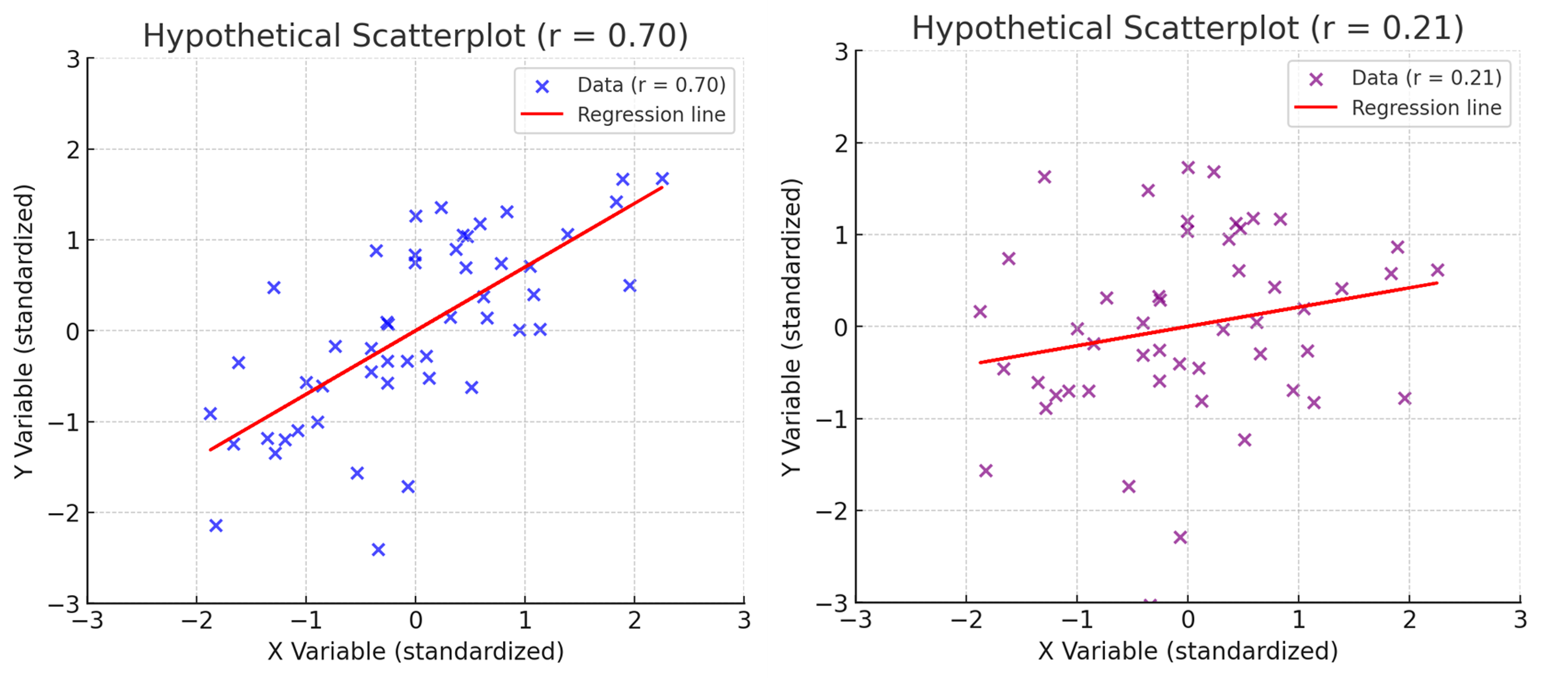
With the second chart, the trend is barely visible. People at the low end of the scale look much the same as those at the high end, and the data is far noisier. And yet, that second effect—visually unimpressive as it may be—is the average effect size reported in pre-registered psychology studies (Schäfer & Schwarz, 2019)2. On paper, it’s “statistically significant.” In headlines, it can become “proof.” But in practice, it may be little more than a statistical blip.
Narratives and Moral Panics
If a small effect can be dressed up to look “significant”, it’s even easier to fit it into a compelling story. In research, compelling stories are currency—they get published, covered, and acted upon.
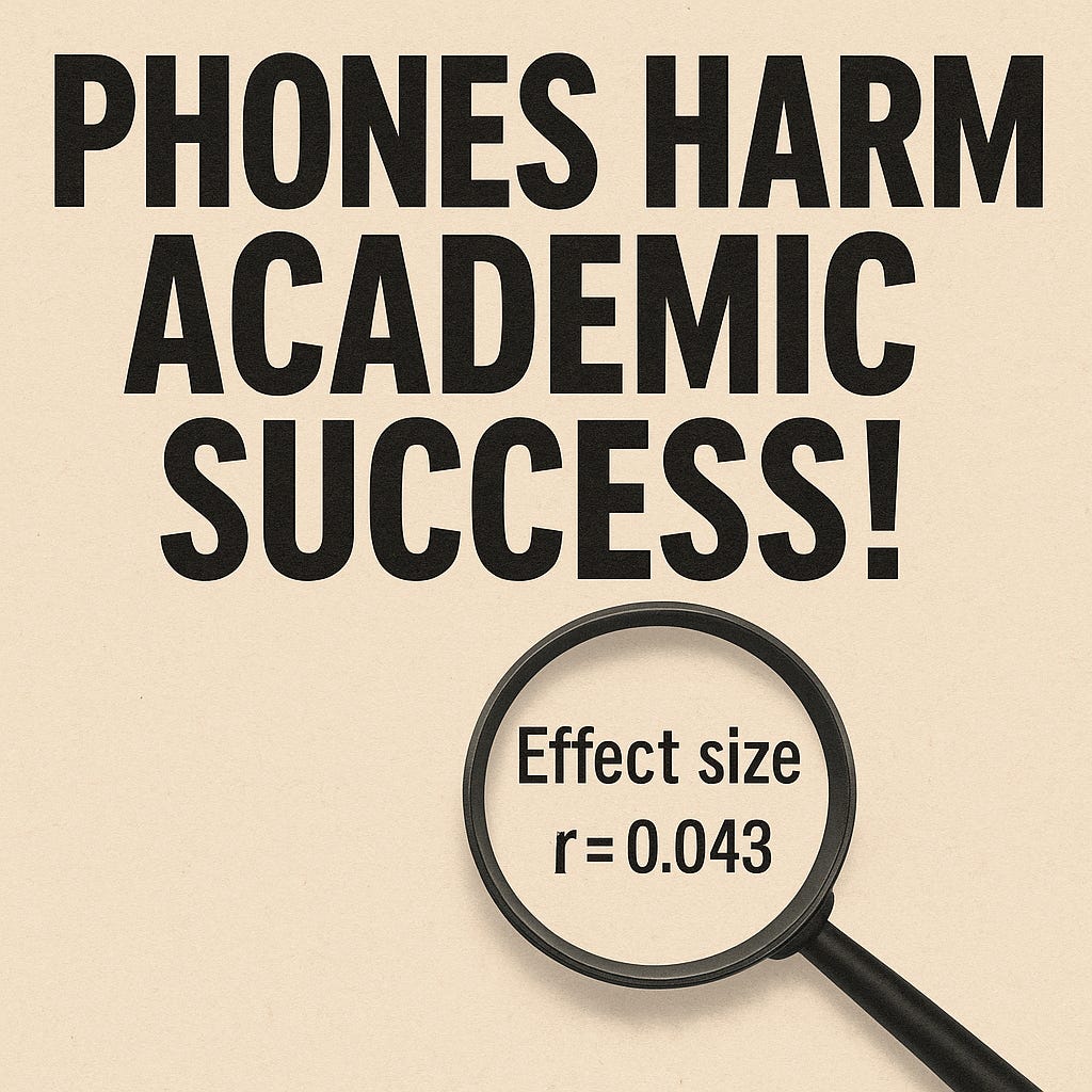
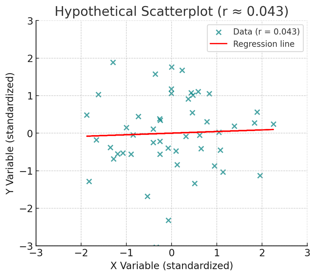
All it takes is for a result to be easy enough to fit into a conclusion that aligns with an existing moral panic. Consider a recent randomized controlled trial involving more than 17,000 students, testing whether removing phones from classrooms would improve academic performance (Sungu et al., 2025). The study did find a statistically significant improvement in grades—but the effect size was miniscule (d = 0.086), which, in keeping with our correlational visuals is equivalent to a correlation of about r = 0.043 (see Figure 2).
In practical terms, that’s negligible. And the researchers found no significant changes in well-being, academic motivation, online harassment, or overall digital use. Still, it’s not hard to imagine how “phone bans show only tiny effects on grades” becomes “removing phones boosts academic performance” in headlines and policy debates. The story fits an existing cultural concern about phones and attention, and once it’s framed that way—helped along by the study’s own title—the small effect becomes a footnote rather than the focal point.
But a study doesn’t need to tap into a moral panic for the same pattern to play out. Consider the recent headlines linking potatoes to Type 2 diabetes3. In the underlying study, potato consumption in general wasn’t associated with increased risk—only fried potatoes were. And so, this seems to say less about potatoes and more about fried foods.
But even there, the numbers tell a more modest story than the headlines—and the study’s own framing—suggest. Replacing three weekly servings of fries with another food was associated with a 7% relative reduction in diabetes risk.
And while that seems meaningful4, the baseline risk in this dataset was around 12.7%, which means the absolute reduction was less than 1 percentage point—roughly 0.9 points, from 12.7% to 11.8%. A small effect, statistically detectable thanks to a huge sample size (175,501), but one that sounds much more dramatic when presented only in relative terms. Once that relative figure is framed as “potatoes cause diabetes”, the scale of the effect—and the nuance about fried potatoes—vanishes.
Whether the topic is phones, potatoes, or the latest tech scare, the process works the same way. But the dynamic isn’t just about how results are framed—it’s also about how they’re received. What makes them stick often isn’t just the way they’re told—it’s that they tell us what we’re already inclined to believe.
Decades of research on motivated reasoning show that people are more willing to accept statistics and arguments that align with their existing beliefs or desired outcomes, and far less likely to scrutinize their weaknesses (Kunda, 1990; Taber & Lodge, 2006). The effects are often small-to-moderate in size (Ditto et al., 2019)—not overwhelming, but strong enough to tilt judgments toward an appealing narrative. When a result feels true—when it fits the story we already believe—it’s easier to overlook how small the effect actually is or to not bother examining it closely in the first place.
When the data fit the story we want to tell, small effects can pass as big ones—not because the evidence is strong, but because it’s convenient. That’s how weak results, paired with a receptive audience, can drive policy, shape public opinion, and fuel moral panics.
Wrapping Things Up
Potatoes, smartphones, social media, and AI don’t share much on the surface, but the way research about them has been packaged and received follows a familiar pattern. A small or highly specific finding gets distilled into a headline-friendly conclusion, often one that aligns with a preexisting narrative. Once it fits the narrative, the effect size becomes secondary—or disappears entirely from public discussion.
This isn’t an argument against studying these topics. Good research questions sometimes produce small effects, and those results can still be valuable. But when weak effects are presented as strong evidence—whether through selective framing, moral urgency, or simply the gravitational pull of motivated reasoning—we risk inflating both their scientific and practical importance.
The real challenge lies in resisting the urge to overhype a study’s implications. That means paying attention to effect sizes, distinguishing statistical significance from practical relevance, and applying the same level of scrutiny to results we like as to those we don’t.
In the end, science is best served when it informs our narratives, not when it’s bent to fit them. There’s never going to be a shortage of social science studies that show weak effects. We just have to be willing to treat them for what they are, not more than that.
Using the same scaling makes it easier to see the real difference between the two: one shows a strong, visible relationship; the other, barely any pattern at all.
The average effect includes both between- and within-subjects designs. The median effect for between subjects designs is r=.12, which would look like even more noise. Thanks, Chris Ferguson, for pointing me towards this particular study.
Admittedly, I did see some accurate coverage of the study, but I also saw plenty of headlines that reported it much the way the study’s press release did.
This is a common reporting shortcut in logistic regression analyses: authors provide a relative risk estimate without the corresponding absolute risk. But without the baseline probability, the relative figure is close to meaningless—a “50% reduction” sounds dramatic, but if the event rate is only 1%, it merely lowers the risk from 1% to 0.5%. That’s far less consequential than the same relative drop applied to an outcome with a 20% baseline probability (which would reduce it to 10%).
Perhaps I'm being cynical but may it be said then that almost any study/survey can be subverted?